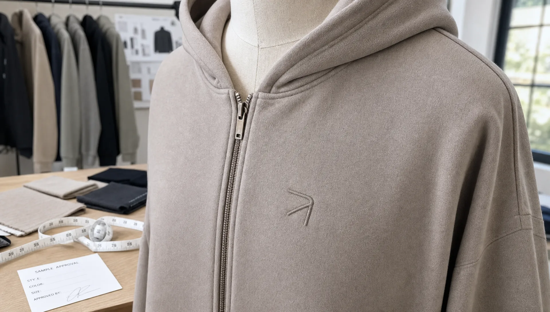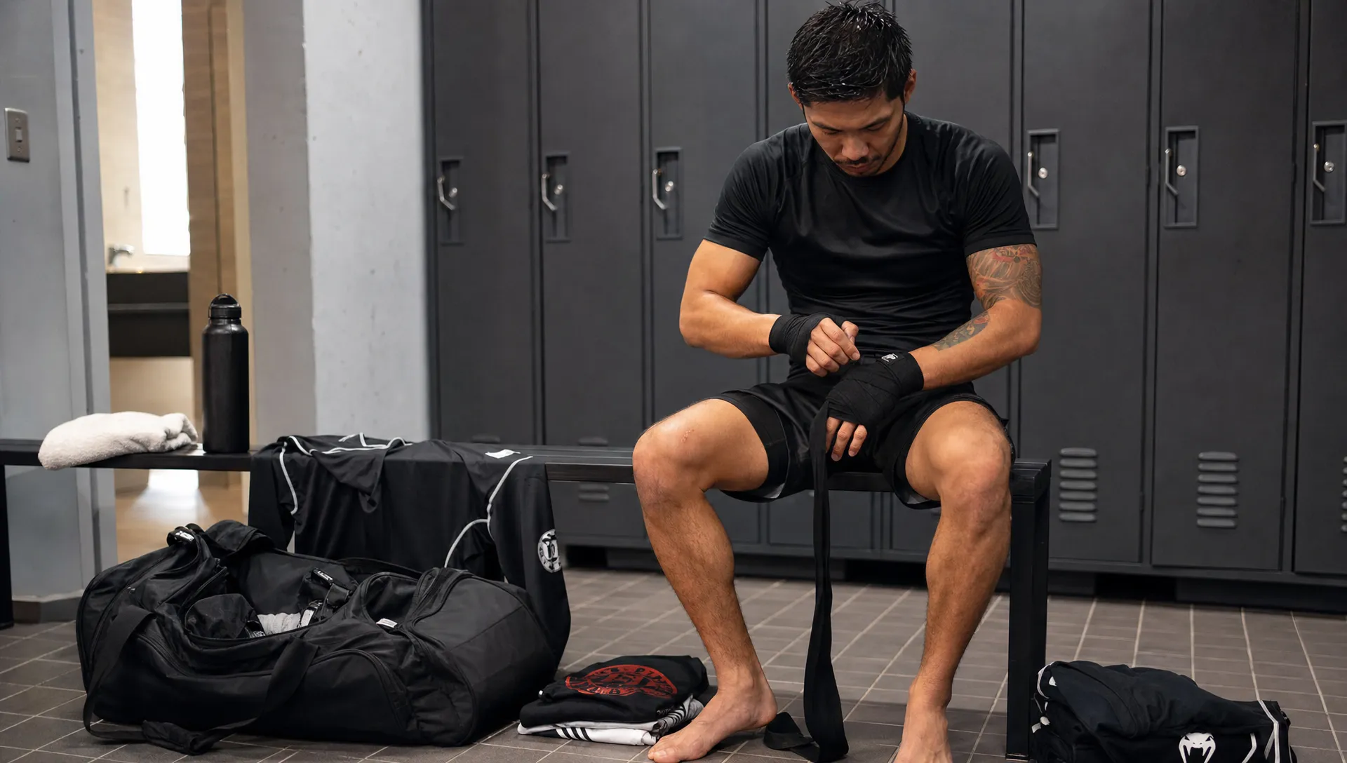
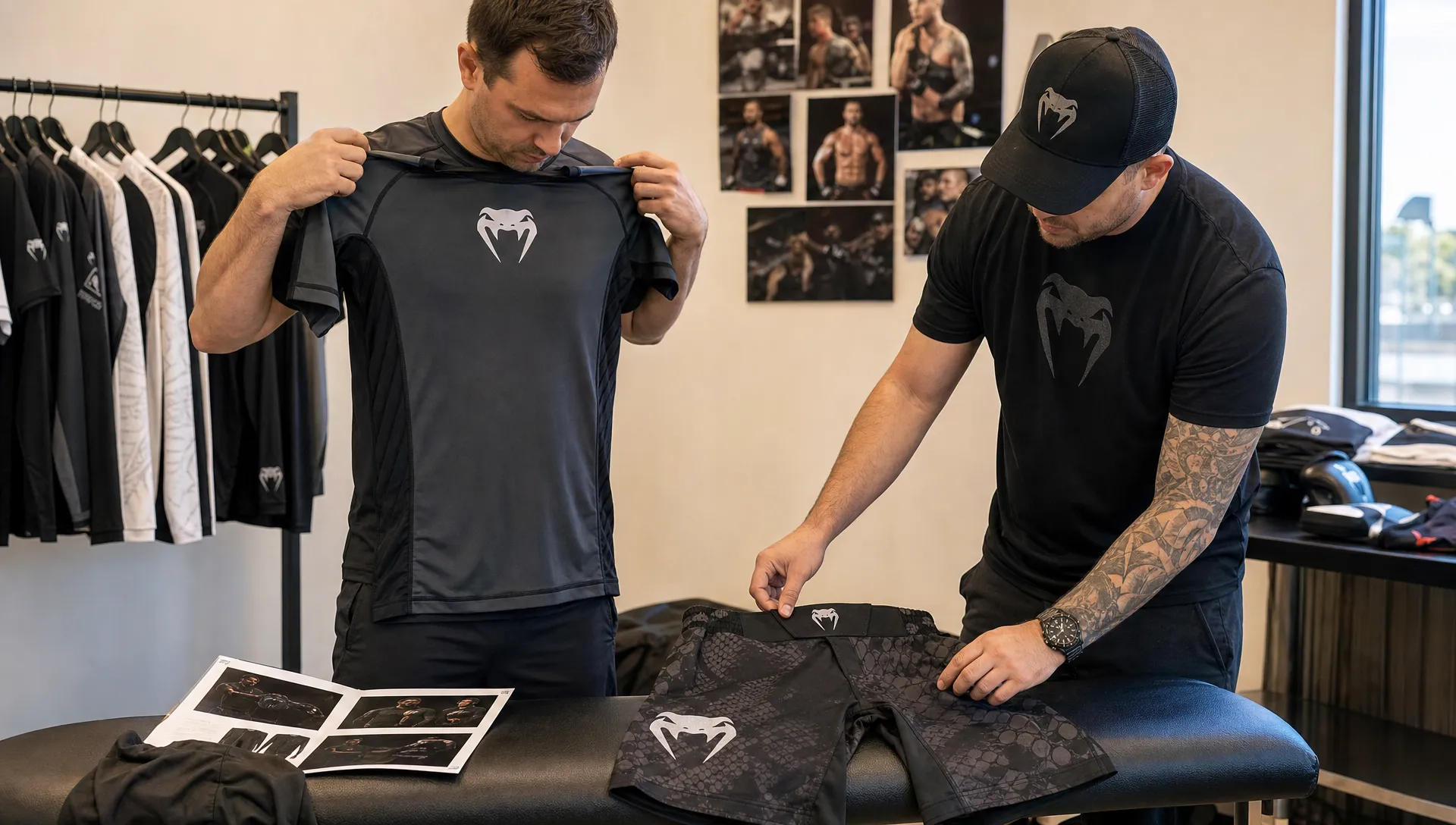
A professional logo does more than decorate a hoodie, rash guard, or pair of fight shorts. It signals that your brand understands the sport, the customer, and the level of detail expected from serious athletic apparel.
For sportswear brands, gyms, MMA teams, and distributors, athletic wear logos need to do two jobs at once. They must look sharp in product photos, on social media, and in retail displays, but they also have to survive sweat, stretching, washing, friction, and repeated use. A logo that looks perfect on a flat mockup can still look amateur once it is printed too large across a curved seam or embroidered on the wrong fabric.
The brands that look pro usually are not using more complicated logos. They are using clearer logo systems, smarter placements, better production choices, and more consistent branding across every garment. If you are developing a fightwear line, gym merchandise range, or private label sportswear collection, here is how to make your logo look like it belongs on premium athletic apparel.
What makes athletic wear logos look professional?
A professional logo for athletic apparel is not just attractive. It is functional. It remains readable when an athlete is moving, stretching, grappling, lifting, or standing under harsh gym lighting. It can be applied consistently across compression wear, shorts, gis, uniforms, tees, hoodies, and labels without losing its identity.
The most reliable sportswear logos usually share a few qualities:
- Simplicity: Clean shapes reproduce better across embroidery, sublimation, heat transfer, and screen printing.
- Scalability: The logo works as a small chest mark, a sleeve icon, a waistband detail, or a large back print.
- Strong contrast: The mark remains visible on dark, light, patterned, or color-blocked garments.
- Sport relevance: The style fits the market, whether that is MMA, boxing, BJJ, fitness, running, or team sports.
- Consistency: The same visual rules appear across apparel, packaging, hang tags, and online product listings.
This is why logo planning should happen before bulk production, not after the first sample is already made. A sportswear logo is part of the product experience. For a deeper look at how visibility and consistency affect recognition, Arus Sportswear has a helpful guide on how athletic apparel logos shape brand recognition.
Build a logo system, not a single logo file
One of the biggest mistakes new sportswear brands make is treating the logo as one fixed design. In practice, one version is rarely enough. A full logo system gives you options for different fabrics, garment types, and placements while keeping the brand recognizable.
A strong athletic logo system usually includes a primary logo, a simplified icon, a wordmark, a one-color version, and sometimes a stacked or horizontal lockup. For combat sports and gym apparel, an icon or monogram can be especially useful because it fits neatly on gloves, shorts, sleeves, collar labels, and small woven details.
| Logo asset | Best use | Why it matters |
|---|---|---|
| Primary logo | Main chest prints, website, packaging, hero products | Establishes the full brand identity |
| Icon or monogram | Sleeves, shorts, gloves, small labels | Stays readable in tight spaces |
| Wordmark | Waistbands, back neck prints, retail branding | Gives clean name recognition |
| One-color version | Embroidery, screen print, patches, tonal designs | Reduces production issues and improves versatility |
| Horizontal or stacked lockup | Different garment panels and product photos | Helps the logo fit multiple layouts |
A good system also prevents overbranding. When every garment has a huge front logo, oversized side logo, back logo, sleeve logo, and waistband logo, the result can look less premium. Pro brands know when to use restraint. A small logo on the chest plus a clean detail on the sleeve can often feel more expensive than a garment covered in marks.
Choose placements that match the garment and the sport
Logo placement is where many apparel concepts start to look either polished or careless. Athletic garments are not flat posters. They stretch, fold, twist, and move with the body. Seams, waistbands, collars, cuffs, and high-friction zones can all affect how a logo appears.
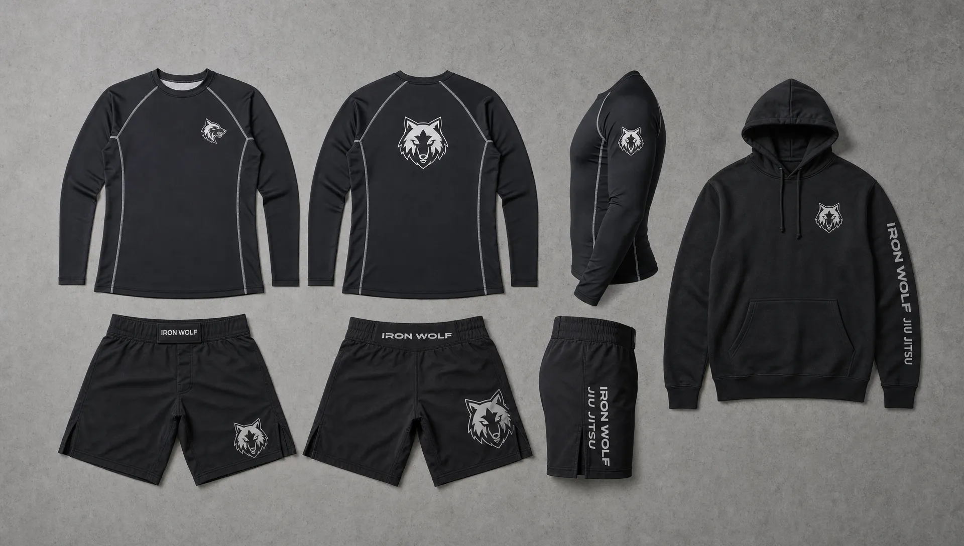
For MMA and martial arts apparel, placement is especially important. Fight shorts need to allow movement without distorting the branding. Rash guards need logos that stretch cleanly over the chest, shoulders, and arms. BJJ gis need patches and embroidery that look premium without affecting comfort or rules compliance for the intended use.
| Garment type | Professional logo placements | Common mistake to avoid |
|---|---|---|
| Rash guards | Center chest, upper chest, sleeve, back shoulder | Placing detailed logos across high-stretch zones without testing |
| MMA shorts | Leg panel, waistband, lower side panel | Running a logo across seams or closure areas |
| Compression tops | Chest, upper back, sleeve | Using a mark that becomes unreadable when stretched |
| BJJ gis | Chest patch, shoulder patch, back patch, pant patch | Adding stiff or oversized branding in uncomfortable areas |
| Boxing shorts | Waistband, lower front panel, side panel | Choosing placements that disappear under movement or gear |
| Hoodies and tees | Left chest, center chest, sleeve, back print | Using too many logo positions on one item |
The best placement strategy depends on how the garment will be worn, photographed, and sold. A logo designed for a professional team uniform may need clear visibility from a distance. A lifestyle hoodie may benefit from a more subtle mark that feels retail-ready. A fightwear brand might use a stronger side-leg logo because that area is visible in action photos and product images.
Match the logo application to the fabric
The same logo can look completely different depending on the application method. A detailed gradient mark may look sharp in a digital mockup but fail in embroidery. A thick rubberized transfer may look premium on a hoodie but feel uncomfortable on a rash guard. A woven patch may elevate a gi but feel bulky on lightweight performance wear.
No single method is best for every product. The right choice depends on fabric type, stretch, wash expectations, order quantity, color count, texture, and the final retail positioning of the garment.
| Logo method | Works well for | Professional advantage | Watch-out |
|---|---|---|---|
| Sublimation | Polyester performance garments, rash guards, shorts | Lightweight and resistant to cracking because the design becomes part of the fabric | Best suited to compatible synthetic fabrics and planned artwork |
| Screen printing | Tees, hoodies, some sportswear panels | Strong color coverage and cost efficiency for bulk runs | Requires proper ink choice and curing for durability |
| Heat transfer | Performance wear, small runs, detailed logos | Sharp edges and flexible placement options | Quality varies by transfer material and application settings |
| Embroidery | Polos, hoodies, jackets, caps, some uniforms | Premium texture and durable appearance | Can feel stiff or distort on very stretchy fabrics |
| Woven patches | Gis, jackets, lifestyle pieces, premium details | Adds a branded retail feel | Needs careful placement to avoid irritation or bulk |
This is where working with an experienced apparel manufacturer becomes valuable. The goal is not simply to place your logo on a garment. The goal is to choose a method that supports the performance, comfort, and perceived value of the product.
Keep colors bold, controlled, and repeatable
Color can make athletic wear logos instantly recognizable, but it can also create production problems if it is not controlled. Neon gradients, tiny shadows, metallic effects, and complex fades may look exciting on screen, yet they are often harder to reproduce consistently across different fabrics and logo methods.
A professional approach usually starts with a tight color palette. Most sportswear brands benefit from one or two core brand colors, a dark neutral, a light neutral, and possibly one accent color. This gives you enough range for seasonal collections without making the brand feel scattered.
Contrast matters even more in athletic wear because products are seen in motion. A charcoal logo on a black rash guard can look sleek in a close-up photo but disappear in a gym, cage, or retail display. On the other hand, a bright white logo on a dark compression shirt can create strong visibility with minimal complexity.
Before approving production, review logo colors in realistic conditions. Look at mockups on phone screens, product photos, indoor lighting, outdoor lighting, and from a distance. If the logo only works in a perfect studio mockup, it may not be strong enough for real sportswear use.
Avoid details that make apparel logos look amateur
A logo can be well designed for a website but still be unsuitable for apparel. The issue is often not the brand concept. It is the level of detail. Athletic garments compress visual information, especially when the logo is small, moving, curved, or applied with thread or ink.
Thin lines, tiny text, complex illustrations, and distressed effects are common causes of weak apparel branding. They may disappear during embroidery, blur during printing, or become unreadable on textured fabric. For MMA, boxing, and gym wear, overly aggressive design can also be a problem. Flames, excessive scratches, skulls, and random combat symbols can make a new brand feel generic rather than serious.
A more professional approach is to create impact through shape, proportion, spacing, and contrast. If the brand personality is bold, the logo can still feel powerful without becoming visually crowded. If the brand is premium, a minimal mark with excellent placement often communicates more confidence than a large, complicated graphic.
Prepare production-ready logo files
Even the best logo can fail if the production files are poor. Manufacturers need clean, accurate files to reproduce branding consistently. A low-resolution image copied from a website is not enough for professional apparel production.
For most athletic wear logos, you should prepare vector files and clear specifications before sampling. Vector artwork allows the logo to scale without losing quality, which is important when the same mark may appear on a chest, sleeve, waistband, and packaging.
A practical logo handoff should include:
- Vector files such as AI, EPS, SVG, or production-ready PDF.
- High-resolution PNG files for mockups and online previews.
- Color references such as Pantone, CMYK, RGB, or HEX values.
- Approved one-color, dark-background, and light-background versions.
- Placement notes with approximate dimensions for each garment.
- Clear spacing rules so the logo is not crowded by seams, zippers, collars, or other graphics.
If you are planning a larger product range, these details belong in your tech pack or brand guideline file. This helps sampling, approvals, repeat orders, and future product development stay consistent. It also supports scale, especially if your brand plans to expand from one product into a full collection. For more planning guidance, see these custom sports apparel tips for brands that want to scale.
Make the logo fit your market position
Not every athletic brand should look the same. A premium BJJ brand, a youth teamwear supplier, a boxing gym, a bodybuilding apparel line, and an MMA fightwear label all need different visual cues. The logo should match the customer’s expectations and the product’s price point.
For combat sports, strong typography and compact marks often work well because they feel tough, clear, and visible. For fitness studios, a cleaner lifestyle-inspired identity may sell better on tees, hoodies, and leggings. For team uniforms, readability and color coordination matter because logos often sit alongside names, numbers, sponsors, and club marks.
Your logo should also support how the product will be sold. If you are selling through a gym, the logo may need to build community pride. If you are selling online, it must look good in small product thumbnails. If you are supplying distributors, the branding needs to feel polished enough to compete next to established labels.
This is where custom apparel becomes a brand-building tool, not just a product. The right garment, fabric, cut, and logo placement can make a new label feel more established from the first drop. Arus Sportswear covers this broader strategy in its article on how custom apparel helps sports brands stand out.
Think beyond the garment
A logo looks more professional when it appears consistently across the whole customer experience. That includes neck labels, size labels, packaging, hang tags, product pages, social media graphics, invoices, and email marketing. When every touchpoint uses different colors, inconsistent spacing, or mismatched logo versions, the brand starts to feel unfinished.
For new athletic apparel brands, this is also where marketing and search visibility come into play. A polished logo and strong product line help build trust, but customers still need to find you. Some growing brands work with specialists such as SEO Bridge’s SEO agency in Cheshire to improve online visibility while they build out their product and brand presence.
The key is alignment. Your logo, apparel quality, website, product descriptions, photography, and marketing should all tell the same story. If your logo says premium performance but your garment execution feels cheap, the brand promise breaks. If your apparel quality is strong but the logo system looks inconsistent, customers may not understand the value.
A simple checklist before approving your logo on athletic wear
Before moving into sampling or bulk production, review your logo like a manufacturer, athlete, and customer would. This prevents small branding issues from becoming expensive production problems.
| Question | Why it matters |
|---|---|
| Is the logo readable at small sizes? | Small placements are common on sleeves, labels, gloves, and waistbands. |
| Does it work in one color? | One-color versions are useful for embroidery, patches, tonal branding, and cost control. |
| Has it been tested on dark and light garments? | Contrast affects visibility in photos and real use. |
| Does the placement avoid seams and high-friction zones? | Poor placement can distort the logo or reduce durability. |
| Is the application method right for the fabric? | Stretch, weight, texture, and washing all affect the final result. |
| Are production files clean and scalable? | Vector files and clear specs reduce errors during sampling and bulk orders. |
If the answer is unclear for any of these questions, fix the issue before production. It is much easier to adjust a file, placement, or logo version during sampling than after a full order is complete.
How Arus Sportswear helps brands bring logos to life
Arus Sportswear manufactures custom MMA and martial arts apparel for brands, gyms, and distributors worldwide. Through private label and OEM production, brands can develop custom fightwear, rash guards, BJJ gis, boxing apparel, sportswear, and combat sports uniforms with their own branding.
For a professional result, bring your logo files, reference designs, garment ideas, and target customer profile into the production conversation early. The more clearly your brand direction is defined, the easier it becomes to align fabric, cut, color, logo method, and placement.
Low minimum orders can also help newer brands test logo placements and product concepts before committing to larger bulk runs. As the line grows, consistent branding across repeat orders becomes one of the strongest ways to build recognition and customer trust.
Frequently Asked Questions
What type of logo works best for athletic wear? A simple, scalable logo usually works best. It should be readable at small sizes, strong in one color, and flexible enough for different garments such as rash guards, shorts, hoodies, and uniforms.
Where should I place a logo on sportswear? The best placement depends on the garment. Chest, sleeve, waistband, leg panel, upper back, and patch areas are common, but the logo should avoid seams, high-stretch zones, and high-friction areas unless the method has been tested.
Is embroidery good for athletic wear logos? Embroidery can look premium and durable on hoodies, polos, jackets, caps, and some uniforms. It is not always ideal for very stretchy or lightweight performance fabrics because it can add stiffness or distort the garment.
Can I use the same logo on MMA shorts, rash guards, and BJJ gis? Yes, but you will usually need different versions or application methods. A full logo may work on a rash guard chest, while an icon, patch, or simplified mark may work better on shorts or gis.
What file format should I send to a manufacturer? Vector files such as AI, EPS, SVG, or production-ready PDF are best for scaling and clean reproduction. High-resolution PNG files are useful for mockups, but they should not be the only files provided for production.
Ready to make your athletic wear logo look production-ready?
A pro-looking logo is not just a design choice. It is the result of smart placement, the right application method, clean production files, and apparel that matches your market.
If you are building a new combat sports or athletic apparel line, Arus Sportswear can support custom designs, private label manufacturing, OEM production, bulk orders, low minimum orders, and worldwide shipping. To plan your next step, explore this guide on how to start your own MMA apparel brand in 2026 or connect with Arus Sportswear to discuss your custom apparel project.