A logo on athletic apparel has a tougher job than a logo on a business card. It has to be recognized while an athlete is moving, sweating, stretching fabric, walking into a gym, posing for a team photo, or appearing in a short social media clip. That is why athletic apparel logos are not just design details. They are brand assets that help customers remember who made the gear and what that brand stands for.
For sportswear brands, gyms, fight teams, and distributors, logo decisions influence how professional a collection looks, how easily fans identify it, and how likely customers are to wear it outside training. A strong logo can turn a rash guard, fight short, hoodie, or gi into a repeat exposure point for your brand. A weak logo, even on a great product, can make the apparel feel generic.
If you are developing custom fightwear or launching a sportswear line, it helps to think of your logo as part of the product experience. As we discussed in our guide to how custom apparel helps sports brands stand out, differentiation is built through design, quality, and consistency. Your logo connects all three.
Why athletic apparel logos matter more than decoration
Brand recognition starts with familiarity. The more often customers see the same visual identity in relevant places, the easier it becomes for them to identify and trust it. Athletic apparel creates those repeated moments naturally because it moves through gyms, competitions, training videos, retail shelves, and everyday streetwear settings.
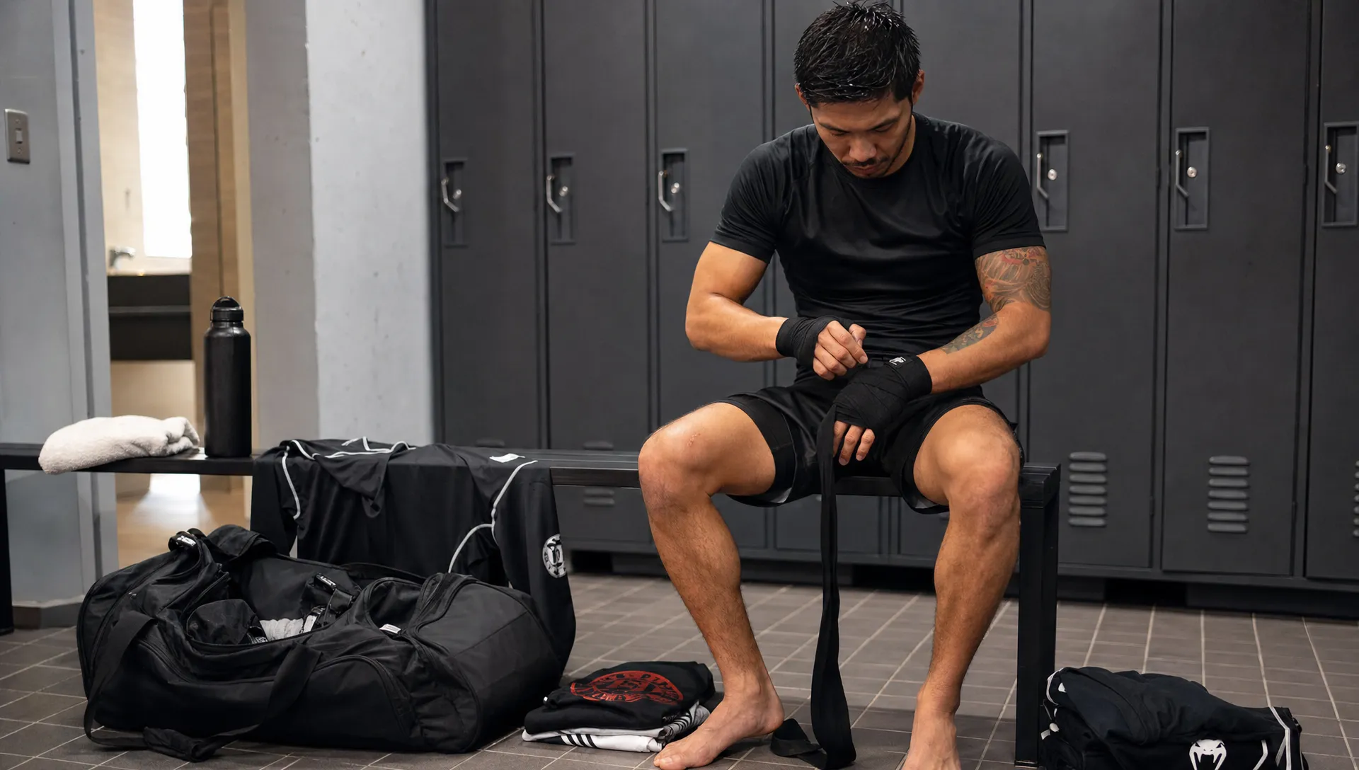
In combat sports, this effect is especially powerful. A logo on a rash guard chest, gi patch, waistband, boxing short, or walkout hoodie is visible in high attention environments. Fans watch athletes. Students look at coaches. Gym members notice what teammates wear. Photos and videos extend that exposure beyond the physical room.
This is why logos help shape three major parts of recognition:
- Visual memory: People learn to identify your mark by shape, color, placement, and repetition.
- Perceived professionalism: A clean, well produced logo makes the apparel feel more intentional and premium.
- Community identity: A logo gives athletes and customers something to represent, not just something to wear.
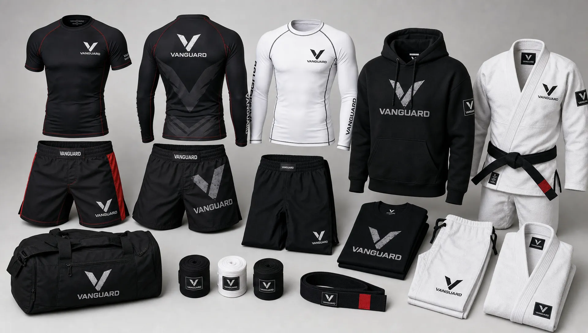
A logo can also make a smaller brand feel more established. When the same mark appears consistently across shirts, fight shorts, rash guards, gis, hoodies, packaging, website visuals, and event photos, customers begin to see a complete brand rather than a one off product.
What makes a sportswear logo recognizable?
A recognizable apparel logo is usually simple enough to read quickly, distinct enough to remember, and flexible enough to work across different garments. The best logos do not rely on complicated details that disappear when stitched, printed small, stretched, or viewed from a distance.
For athletic apparel, recognition depends on practical design conditions. A logo may look sharp on a laptop screen but lose impact on black compression fabric. It may look bold on a flat mockup but distort across the shoulder of a rash guard. It may feel unique in full color but become unclear when converted to one color embroidery.
Strong sportswear logos usually share these traits:
- Simple silhouette: The outline is recognizable even without small details.
- Clear contrast: The logo stands out against dark, light, patterned, or sublimated fabrics.
- Scalable structure: The mark works on a chest print, woven label, sleeve hit, waistband, or social media avatar.
- Consistent spacing: The logo does not feel cramped, stretched, or too close to seams.
- Relevant personality: The design matches the brand’s positioning, whether technical, aggressive, premium, traditional, or youth focused.
Recognition is not about making the biggest logo possible. It is about making the logo instantly identifiable in the right context. In some cases, a small icon on the sleeve can be more memorable than an oversized chest graphic if it is placed consistently and used across multiple products.
Logo placement turns apparel into advertising
Placement is one of the most overlooked parts of athletic apparel branding. The same logo can feel premium, amateur, bold, subtle, or performance focused depending on where it sits on the garment.
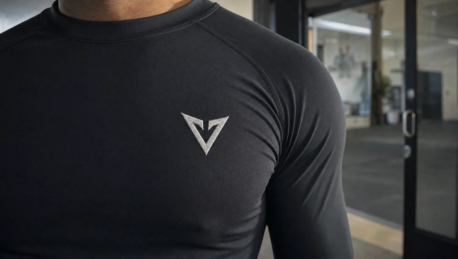
A front chest logo on a training tee feels direct and commercial. A small upper back logo can feel more refined. A sleeve mark creates recognition in side view photos and videos. A waistband mark on fight shorts can become a signature brand cue. A gi patch can reinforce team identity and tradition.
The key is to match placement with how the garment will be used. A logo for a competition rash guard should be visible during movement and grappling positions. A hoodie logo should work when the athlete is walking into the gym or appearing in lifestyle content. A boxing robe or walkout jacket can support larger branding because it is often worn in high visibility moments.
| Logo placement | Recognition value | Best used for |
|---|---|---|
| Left chest | Classic, professional, easy to identify | Tees, polos, hoodies, team apparel |
| Center chest | High visibility and strong retail impact | Rash guards, shirts, walkout tops |
| Sleeve | Memorable secondary branding | Rash guards, hoodies, jackets |
| Waistband or side panel | Signature product identity | Fight shorts, compression shorts |
| Back neck or upper back | Subtle repeat exposure | Tees, hoodies, training tops |
| Gi patch locations | Team and academy recognition | BJJ gis and martial arts uniforms |
Good placement also supports photography. If logos are hidden under folded arms, distorted by seams, or blocked in common athletic positions, recognition drops. Before approving production, brands should review mockups from front, side, back, and movement based angles.
Production choices can strengthen or weaken the logo
A logo is only as strong as its execution. Athletic apparel involves fabrics and production methods that affect how the final mark looks and lasts. Compression fabric, mesh panels, heavyweight cotton, satin boxing shorts, and woven gi fabric all handle branding differently.
Sublimation is common for rash guards and fight shorts because it allows graphics to become part of the fabric. This can create vibrant, durable designs, but it also means the logo must be planned as part of the full garment layout. If the background is too busy, the logo can disappear.
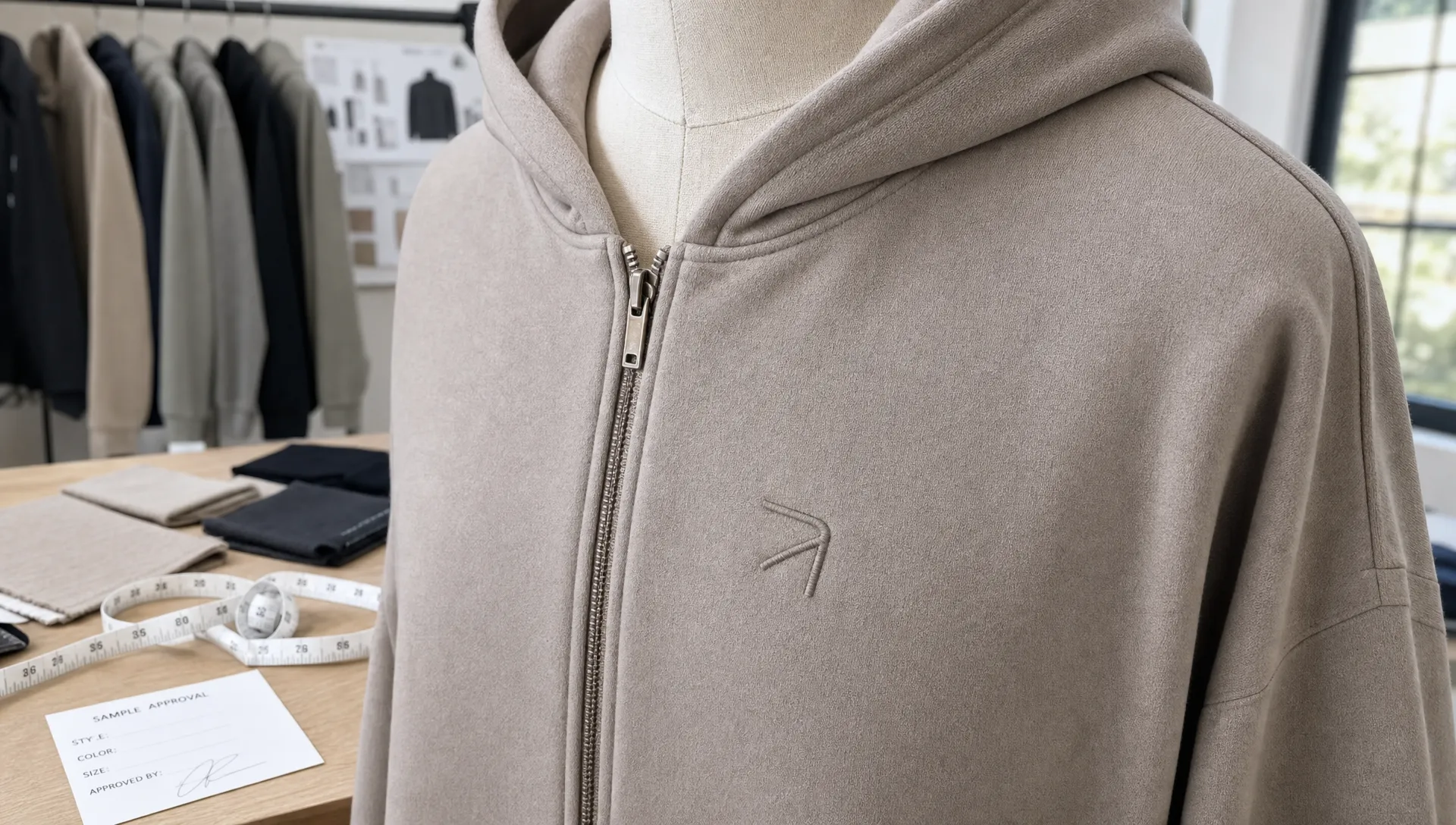
Embroidery can feel premium on gis, jackets, hats, and heavier garments, but it requires simplification. Tiny gradients, thin lines, and complex textures often do not translate well to thread. Screen printing works well for many tees and hoodies, but ink choice, curing, and fabric compatibility matter for durability. Heat transfers can be useful for names, small runs, or certain technical garments, but they must be tested for stretch, wash performance, and feel.
| Branding method | Strength | Logo design consideration |
|---|---|---|
| Sublimation | Great for all over performance graphics | Keep the logo readable against patterns and color blends |
| Embroidery | Premium, textured, durable on heavier items | Simplify details and avoid very thin lines |
| Screen printing | Strong for tees, hoodies, and bold graphics | Use clean shapes and test ink compatibility |
| Heat transfer | Flexible for names, numbers, and smaller runs | Test stretch, wash durability, and hand feel |
| Woven or printed labels | Reinforces brand after purchase | Keep typography clear at small sizes |
This is where the manufacturing partner becomes important. A brand may have a strong logo file, but if the factory cannot advise on placement, technique, color matching, and sampling, the finished apparel may not carry the brand well. If you are evaluating production partners, our article on choosing the right martial arts clothing manufacturer explains what to look for before committing to a supplier.
Color and typography shape memory
Color is one of the fastest recognition cues in apparel. A customer may notice the color palette before they can read the brand name. This is why sportswear brands often benefit from owning a small set of consistent colors rather than changing the palette on every product.
For example, a combat sports brand might use black, white, and a specific accent red across its rash guards, shorts, labels, and packaging. A youth academy might choose brighter colors to feel energetic and approachable. A premium performance brand might use restrained neutrals with one sharp contrast color.
Typography matters just as much. The font in a wordmark needs to be readable at small sizes, especially on woven labels, sleeve prints, and online thumbnails. Overly decorative type can look interesting on a mood board but fail on actual garments. In athletic apparel, type should usually feel strong, balanced, and easy to read in motion.
If your brand uses both a symbol and a wordmark, test them separately. The symbol should be strong enough to stand alone on small placements. The wordmark should remain legible when printed or embroidered. Together, they should feel like one system rather than two unrelated graphics.
Build a logo system, not just one logo
A single logo file is rarely enough for a full apparel line. Sportswear brands need a logo system that works across product categories, production methods, and customer touchpoints.
A practical logo system may include:
- Primary logo: The full brand mark for main chest prints, packaging, websites, and hero products.
- Secondary icon: A simplified symbol for sleeves, waistbands, labels, zipper pulls, and small placements.
- Wordmark: A text based logo for clean applications where the brand name needs to be clear.
- Badge or patch version: A framed version for gis, jackets, team uniforms, and limited edition products.
- One color version: A simplified version for embroidery, tonal prints, labels, and cost efficient production.
This system helps customers recognize the brand even when the full logo is not shown. Think about how premium service brands use the same visual cues across vehicles, uniforms, booking pages, and customer touchpoints. A nationwide luxury transportation company such as Grand Limousine relies on consistent presentation to make its service feel recognizable and reliable before the ride even begins. Apparel brands can apply the same principle by making every logo application feel connected.
A logo system is also useful when building collections. If every item carries the brand in a slightly different way, the line feels scattered. If each product uses the same visual rules, the collection feels intentional. For more guidance on planning product families, review our guide on building a sportswear collection customers actually want.
Legal protection and originality matter
Recognition only has long term value if the logo is truly yours. Before investing in bulk apparel, brands should check that their logo is original and not confusingly similar to another company’s mark. This is especially important in sportswear, where animal icons, shields, initials, aggressive typography, and fight inspired symbols are common.
The U.S. Patent and Trademark Office explains that trademarks help identify the source of goods or services. In apparel, a distinctive logo can become one of the assets customers use to connect products back to your brand. That makes clearance and protection worth considering early, especially before scaling distribution.
Originality also helps with customer trust. Copycat logos may get attention in the short term, but they weaken brand credibility. A logo that reflects your own story, audience, and design language gives customers a reason to remember you.
Common logo mistakes in athletic apparel
Many branding problems are not caused by bad products. They come from logo decisions that were never tested in real apparel conditions.
One common mistake is adding too much detail. Fine lines, shadows, textures, and complex illustrations may look impressive on a large screen but fail when printed small or embroidered. Another mistake is ignoring contrast. A dark gray logo on black fabric may look subtle in a mockup but nearly invisible in the gym.
Inconsistent use is another issue. If the logo changes size, color, position, and style on every garment, customers do not get enough repeated exposure to remember it. Brands also run into problems when they approve designs without sampling. Fabric stretch, seam placement, and print technique can all change the final appearance.
To avoid these issues, test your logo in real conditions before scaling production. View it at thumbnail size, from across the room, on light and dark fabrics, and in the actual branding method you plan to use. If it still feels clear and recognizable, it is more likely to perform well in the market.
How logos support sales, loyalty, and community
A strong logo can make apparel easier to sell because it gives customers a visible identity to join. This is especially true for gyms and martial arts academies. Members often buy branded gear not only for function but also to show belonging.
For independent sportswear brands, a recognizable logo helps build repeat purchases. If a customer likes the first rash guard and later sees the same mark on shorts or a hoodie, the buying decision becomes easier. For distributors, consistent branding can make a product line easier to present to retailers because it looks organized and market ready.
Logo recognition also supports social proof. When athletes, coaches, and gym members wear the same mark in photos and videos, the brand appears active and trusted. Over time, this can turn customers into ambassadors.
If you are planning branded gym merchandise, the product mix matters too. Our guide to custom branded clothing ideas that sell for gyms covers apparel categories that can help gyms turn identity into revenue.
Bringing your logo to life through custom manufacturing
Designing a strong logo is only the first step. The next step is applying it correctly across garments, fabrics, sizes, and production methods. For MMA and martial arts apparel, that can include rash guards, fight shorts, BJJ gis, boxing apparel, karate uniforms, hoodies, tees, and other branded gear.
Arus Sportswear manufactures custom MMA and martial arts apparel for brands, gyms, and distributors worldwide. With private label and OEM production, custom designs, branding options, low minimum orders, bulk order support, and worldwide shipping, brands can turn a logo concept into a complete apparel line without treating branding as an afterthought.
The best results happen when logo design, garment design, and production planning work together. Your logo should not be pasted onto apparel at the end. It should be part of the collection from the first mockup.
Frequently Asked Questions
Why are athletic apparel logos important for brand recognition? Athletic apparel logos create repeated visual exposure in gyms, competitions, retail settings, and social media content. When the same logo appears consistently across products, customers become more familiar with the brand and can identify it faster.
What makes a logo work well on sportswear? A strong sportswear logo is simple, readable, scalable, and easy to reproduce across different fabrics and branding methods. It should remain clear on small labels, stretched performance fabrics, embroidered patches, and high contrast product designs.
Where should I place my logo on athletic apparel? The best placement depends on the garment and use case. Chest logos work well for visibility, sleeve logos create secondary recognition, waistband logos can become signature details on shorts, and gi patches help reinforce team or academy identity.
Should my sportswear brand have more than one logo version? Yes. Most apparel brands benefit from a logo system that includes a primary logo, a secondary icon, a wordmark, a one color version, and possibly a badge or patch version. This keeps branding consistent across different products and production methods.
How can I avoid logo quality issues in production? Use vector artwork, test the logo on real fabrics, check contrast on different colors, simplify embroidery details, and review samples before bulk production. Working with a manufacturer experienced in martial arts and sportswear apparel can help prevent costly mistakes.
Ready to make your logo recognizable on real apparel?
Your logo should do more than fill space. It should help customers remember your brand, trust your products, and feel connected to your community. If you are building a private label MMA, martial arts, or athletic apparel line, Arus Sportswear can help bring your custom branding to life through OEM and private label manufacturing.